
How to customize your emails with the Email Editor
Introduction
The emails your customers receive are part of your brand, so they should look and sound like you. The Email Editor lets you build professional, responsive emails with a visual drag-and-drop canvas: add your branding, edit copy and images, style buttons, and preview the result before you save. This guide walks you through building an email from a blank canvas to a saved template you can use in your Campaigns.
Before you begin: set up your Brand Styles
Set up your Brand Styles before you edit individual templates. Brand Styles are your single source of truth for shared branding: reusable colors, typography, button styling, corner shapes, and image assets such as logos and banners. Once configured, they sync into the Email Editor and apply across all your templates, so you keep every email consistent without updating each one by hand.
💡 Tip: Use Brand Styles for anything that should look the same across emails (logos, brand colors, button style). Use the Email Editor itself only when one specific template needs a one-off change. If a change should apply to several emails, update Brand Styles instead.
For the full setup, see How to set up Brand Styles and apply them to your emails.
Build your email: step by step
Every email is made from two building blocks: Structures define the layout (rows and columns), and Content Blocks hold the actual content (text, images, buttons, dividers, social icons, and more). You will add a structure first, then fill it with content blocks.
Step 1: Open the Email Editor
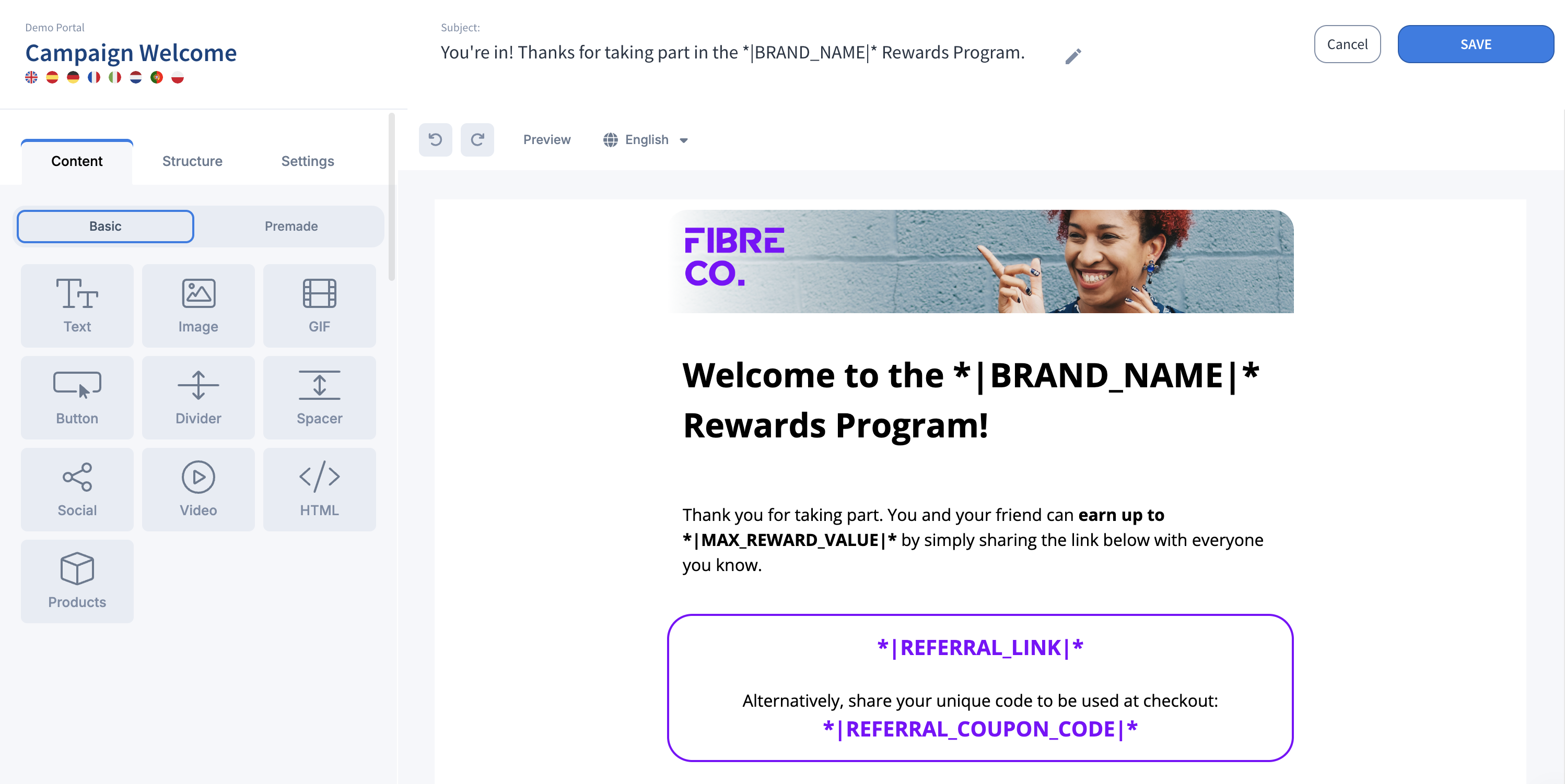
Navigate to your brand or campaign email and open the Email Editor. The editor is organized into three areas:
- Top Bar: template information, active languages, subject line options, and the Save and Cancel actions.
- Control Panel: where you add content blocks and structures and adjust email settings.
- Preview Canvas: where you build and review your email in real time.
Step 2: Choose and add a structure
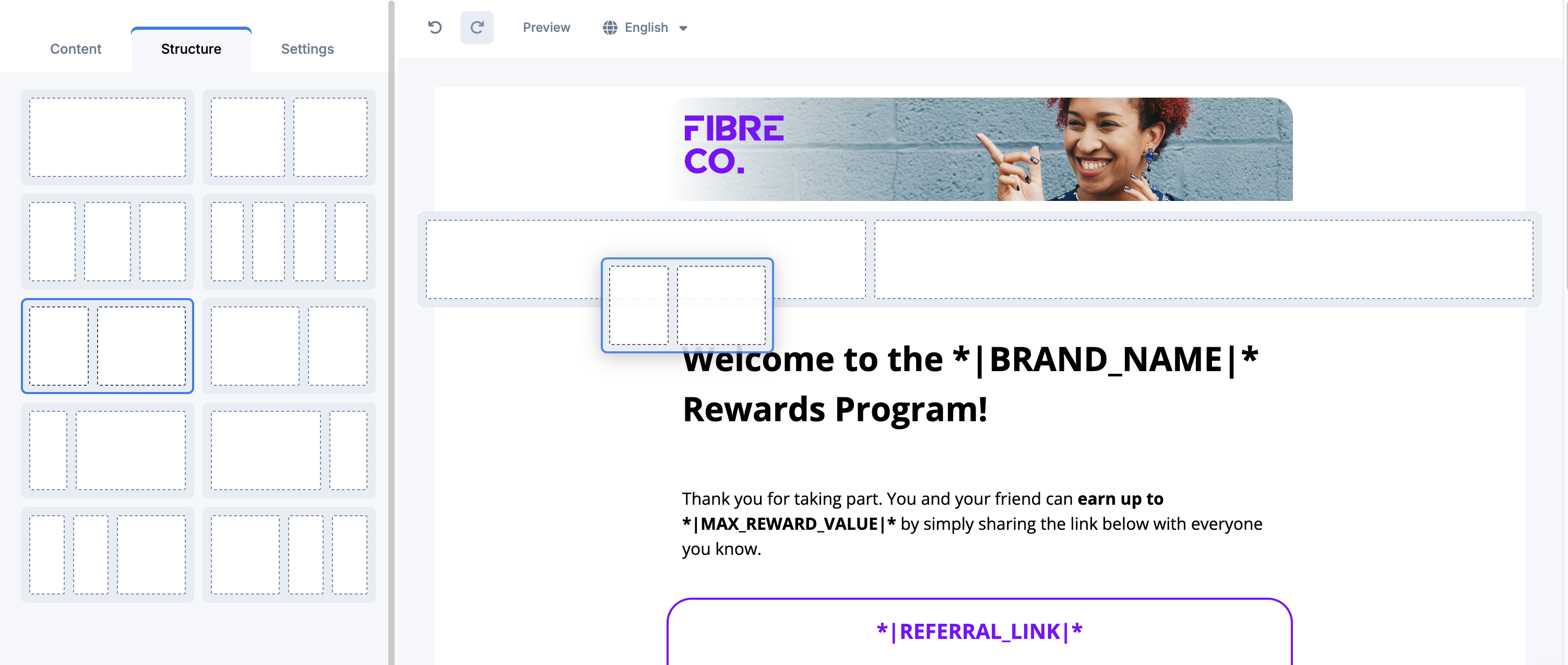
Select a structure (for example, a single column or a two-column row) and drag it onto the Preview Canvas. The structure drops in as an empty layout ready to receive content.
Step 3: Add content blocks
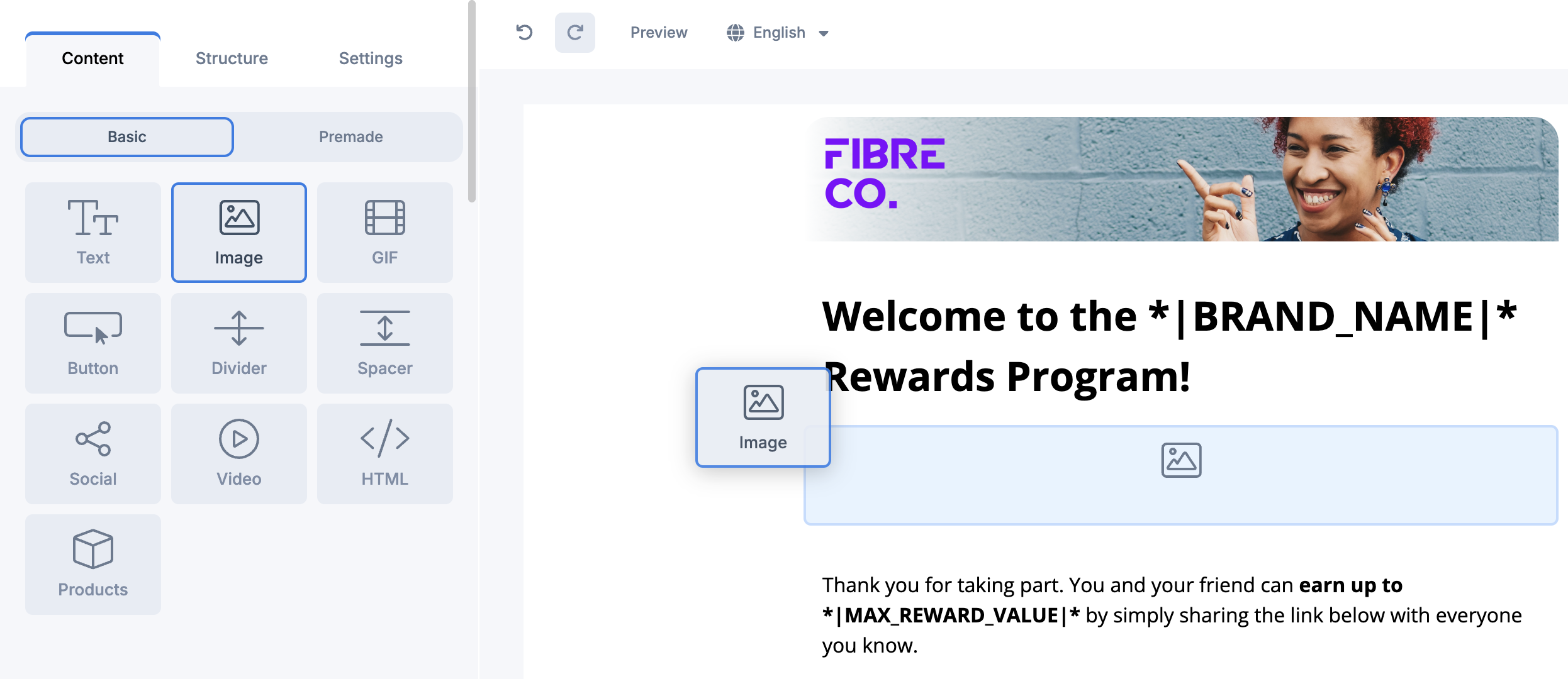
Drag a content block (Text, Image, Button, and so on) into a column or section of your structure. Repeat until each area of the email holds the content you want. You can add as many blocks as you need.
Step 4: Edit your content
Click any block to edit it directly on the canvas. Text is editable inline, and images and buttons open their own settings. For the full options available in each block, see Editing your content below.
Step 5: Customize colors and styling
Adjust colors, spacing, and formatting to match your campaign. You can restyle the email background, structures, columns, text, buttons, links, and borders. Where a style comes from Brand Styles, changing it here affects only this template.
Step 6: Preview across desktop, mobile, and dark mode
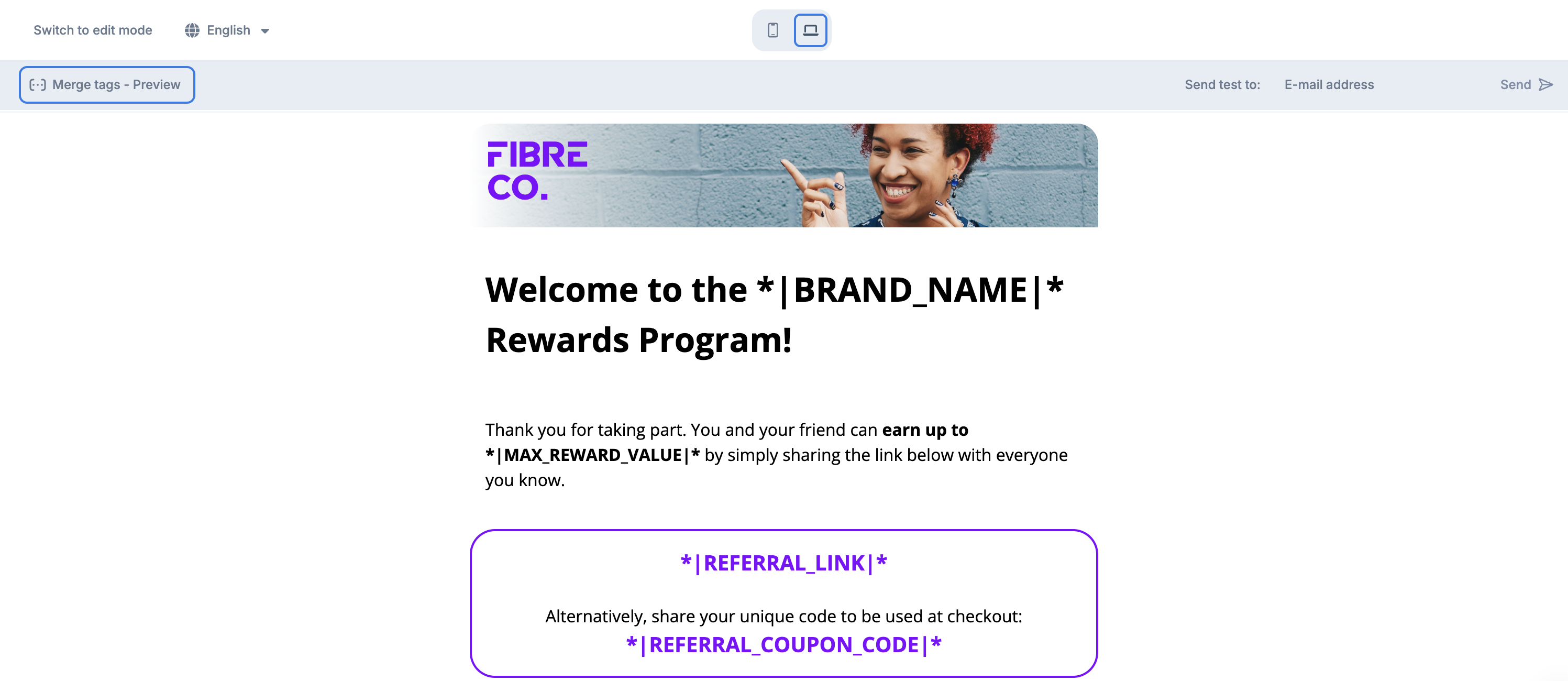
Switch between desktop and mobile preview to confirm the layout holds on smaller screens, and check dark mode so nothing disappears against a dark background. Review your active language versions and subject lines here too.
Step 7: Save your template
When the email looks right on both desktop and mobile, save your template from the Top Bar. Your saved template is then ready to use in your Aklamio Campaigns.
You can move, duplicate, or remove any structure or content block at any point, so it is easy to keep adjusting after your first save.
Editing your content
Each content block has its own set of options. Here is what you can change in the ones you will use most.
Text
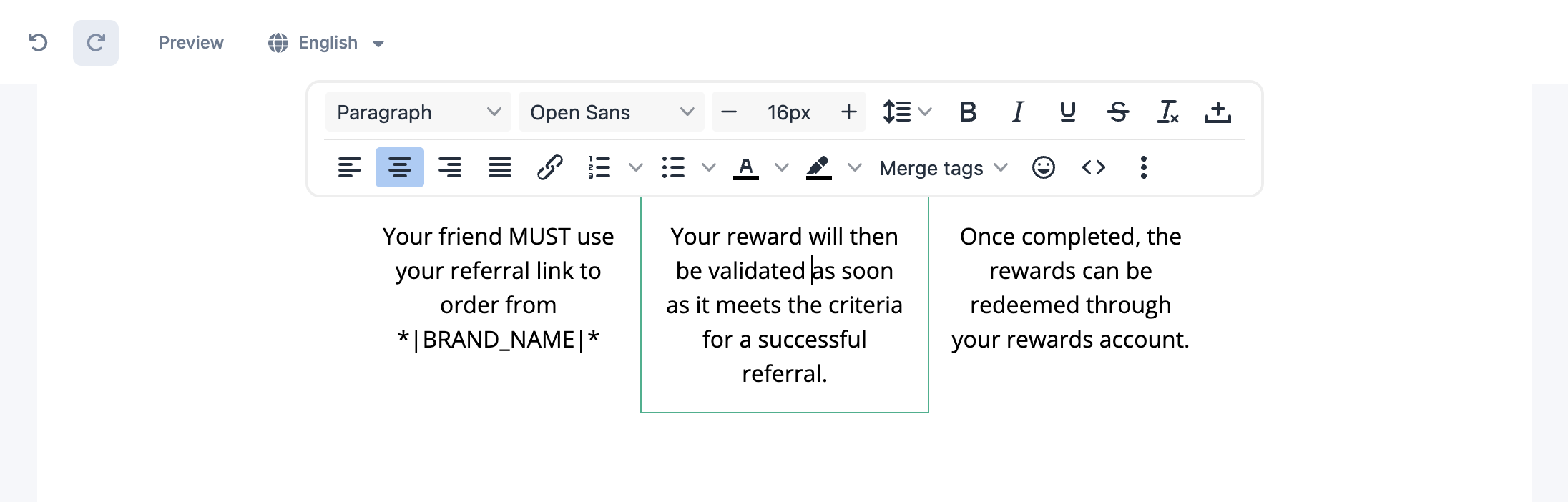
Click inside any text block to edit it directly. Available formatting includes:
- Font selection
- Font size
- Bold, italic, and underline
- Text color
- Lists
- Hyperlinks
- Text alignment
Images
Add an image by dragging an Image block into your layout. You can then:
- Upload or select an image
- Replace an existing image
- Resize the image
- Adjust alignment
- Add a clickable link by setting a destination URL
- Add alternative text for accessibility
💡 Tip: Use Brand Styles assets for recurring visuals like your logo. Edit an image directly in the editor only when one email needs a unique picture.
Buttons
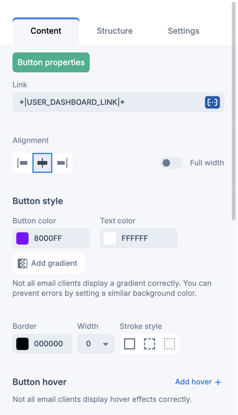
- Button label
- Link (Destination URL)
- Button color
- Text color
- Border radius
- Padding
- Alignment
- Width
Buttons can also include hover styles in email clients that support them. For consistent buttons across templates, manage button styling through Brand Styles, and change a button here only when one template needs to look different.
Colors
You can change colors throughout the email, including the background, structures, columns, text, buttons, links, and borders. Use Brand Styles for shared brand colors whenever you can, and change colors in the editor for one-off adjustments. For richer designs, the editor also supports color gradients and hover effects on supported elements.
💡 Tip: Gradients and hover effects are not supported by every email client, so always preview before you save.
Other content blocks
The editor also includes Divider, Spacer, Social Media Icons, Video, HTML, and Product blocks. Use these to build richer layouts while keeping the email responsive.
Reuse and reorganize content
Building emails is faster when you reuse what you already have. You can:
- Duplicate an entire section or an individual block
- Drag sections and blocks to reposition them
- Delete elements you no longer need
- Undo or redo recent changes
These tools let you test different layouts without starting over.
Design for mobile
Every email is responsive by default and adapts to different screen sizes automatically. Before you save, switch to mobile preview to check the result. For the best mobile experience:
- Keep paragraphs short
- Use clear headings
- Make buttons easy to tap
- Leave enough spacing between sections
- Use optimized images
- Confirm content appears in the right order
You can also set specific elements to show only on desktop or only on mobile where that helps.
Reset a style to its default
If you have customized a property and want to return to its original value, use the Reset option for that property. Resetting restores the default or inherited styling without affecting the rest of your design, which is useful when you have been testing template-specific tweaks and want to step back.
Save, download, and export
Save your work at any time to continue later. Before saving, review both the desktop and mobile layouts so everything displays correctly. Depending on your configuration, you may also be able to export or download your email as HTML for external use.
💡 Best practices
- Set up your Brand Styles before you build or edit any template.
- Manage reusable colors, typography, buttons, and assets through Brand Styles, and use the editor for template-specific changes only.
- Keep branding consistent across every customer email.
- Write concise, easy-to-read copy with clear headings.
- Focus on one primary call-to-action per email whenever you can.
- Optimize images so emails load quickly.
- Preview on desktop, mobile, and dark mode before saving.
- Review all active language versions and localized subject lines.
- Test every link and button before you launch your campaign.
- Use gradients and hover effects sparingly to stay compatible across email clients.
🛠️ Troubleshooting / FAQ
I changed a color in the editor, but my other emails did not update. Why? Changes made inside the Email Editor apply only to the template you are editing. To update several emails at once, change the value in Brand Styles instead, and it will sync across your templates.
My gradient or hover effect looks wrong in some inboxes. Not every email client supports gradients and hover effects. Use them sparingly and always check the preview. If an inbox is critical for your audience, prefer a solid color so the email renders reliably everywhere.
My layout looks fine on desktop but breaks on mobile. Emails are responsive by default, but long paragraphs, oversized images, or many columns can crowd a small screen. Switch to mobile preview, shorten copy, use optimized images, and consider setting some elements to show only on desktop or only on mobile.
I want my original styling back after experimenting. Use the Reset option on the specific property to restore its default or inherited value. This affects only that property, so the rest of your design stays as it is.
I customized an image, but it should be the same across all emails. Recurring visuals like your logo belong in Brand Styles. Move the asset into Brand Styles so every template pulls the same image, and reserve editor-level image changes for one-off visuals.
🔗 Related articles
- How to set up Brand Styles and apply them to your emails
- Navigating the Email Editor
- Managing brand level emails
- Customize campaign emails